Showing posts with label Micron. Show all posts
Thursday, August 2, 2018
The Host of the Slayer of God
"The Host of the Slayer of God"
(Xenogears)
Xenogears had been on the mind a lot this year, being the 20th Anniversary and all. And I wanted an excuse to do an Alphonse Mucha-esque art nouveau piece. This also makes my third Fei piece in one year.
I wanted the background effect to go through the primary colors and also reflect the struggles Fei had gone through over the course of the game, with Zohar and a Xenogears motif adorning the top. The colors on the actual piece mixed too much between bright and dull, so I decided to mute them a bit for the final render, as well as add a "paper texture" to the background.
September 2, 2018
Micron pens, Sakura Pigma pens, Prismacolor Markers, colored pencils, and gel pens
on 11x17" cardstock
Paper color and texture added in Photoshop Elements 7.0
Tuesday, May 1, 2018
Doth Thou Desire the Power?
"Doth Thou Desire the Power?"
(Xenogears)
There's not a lot I can say about Grahf that isn't spoiler-territory, but suffice to say he's definitely one of the more sympathetic villains in the massive story of Xenogears. His outfit also stands out a lot, reminiscent of a dark royal jester. It's the type of design that leaves an impression.
To start with the obvious, I was inspired by those variant covers to BOOM! Comics' Power Rangers done by Goñi Montes. And as Grahf is the masked villain of Xenogears (For good reason), it just sorta clicked.
Coloring was interesting given the detail of his outfit. A LOT of details scattered among the ensemble, and the colors were difficult to do in a way that made the focal points pop.
The background - what little there is - was a mix of markers and chalk pastels, but for the final, I did a little blurring to mask the harsh pastel marks that refused to blend.
May 1, 2018
Micron Pen, Sakura Pigma pens, Prismacolor Markers, colored pencils, chalk pastels, and gel pens
on 8.5x11" cardstock
Background blurring done digitally via Photoshop Elements 7.0
Labels:
2018,
chalk pastels,
Grahf,
Micron,
Prismacolor,
Xenogears
Monday, November 6, 2017
The Prophecy
"The Prophecy"(10-year update)
(Original Characters)
Sorry if I'm spamming my own creations, but my interest super-piqued recently. This is a redo of a piece I did back in either 2007, and never posted on here for whatever reason (but can be seen below). I think I let this piece kinda run with my minor inspiration of The Record of Lodoss War, which when I created these characters and story, I had only seen 2 episodes of the OVA randomly in even earlier 2000's. (After watching it again last year, it's weird how much stuck with me about it.)
As with many of my remakes, I've switched from digital to traditional mediums, but I'd like to think my understanding of anatomy, wings, and overall composition has improved. Some might say the lighting on the older one may have looked more dynamic, but I believe that hides just how bad the linework was. Also happier with the color balance for this one, as well. The character designs have also shaped up well, and definitely wanted to reflect that in this update.
November 6, 2017
Micron pens, Sakura Pigma pens, Prismacolor Markers, and gel pens
on 8.5x11" cardstock.
(*Paper texture added digitally via Photoshop Elements)
"The Prophecy"
(Original Characters)
April 15, 2007
Normal Pens and PainterClassic
2810x4000 pixels
Labels:
2017,
gel pens,
Micron,
OC,
Prismacolor,
Traditional
Monday, October 30, 2017
Heaven Near
"Heaven Near"
(Original Character)
This is a counterpart piece to an illustration I did back in 2015. I actually conceptualized this way back then, but failed to get anywhere with it. Since my interest in my story has suddenly skyrocketed (See: every other post for the last 2~3 weeks), I felt the need to finish this one in between my character designs.
I was concerned about using the character's main color palette since the outfit for her here differs from her actual design, but the other plan would have either clashed or blended with the background. I think keeping with her proper colors lets her pop from the image more.
October 30, 2017
Micron pens, Sakura Pigma pens, Prismacolor Markers, colored pencils, and gel pens
on 8.5x11" cardstock.
(*Paper texture added digitally via Photoshop Elements)
Labels:
2017,
colored pencil,
gel pens,
Micron,
OC,
Prismacolor,
Traditional
Friday, October 13, 2017
The Show Must Go On
"The Show Must Go On"
(The Big O)
Another long-shelved project completed! I first fully saw The Big O late last year, and I loved it, from its visual aesthetic (at least in the first season), to its form of storytelling, to its giant robots. Big O has a lot to like, though it also has a lot to throw off casual viewers. Either way, to me, the pros far outweigh the cons, and it earned a spot among my favorite anime.
I mentioned on the previous one that I did was to reference for this. Despite how it looks, this image is NOT digitally inverted. It was colored relatively side-by-side to the OFFSET version, using it as a reference to how the shading lied naturally, and used another screencap for color reference to color this one, because in series, Big Venus appears inverted like this. The line work was done with a white gel pen, especially to clean up areas where the markers bled into the negative space. This may be my most ambitious piece yet, and it definitely paid off!
October 13, 2017
Micron pens, Prismacolor Markers, colored pencils, and gel pens
on 8.5x11 cardstock
Labels:
2017,
Big O,
Big Venus,
gel pens,
Micron,
Prismacolor,
Traditional
The Show Must Go On Ver.OFFSET
"The Show Must Go On Ver.OFFSET"
(The Big O)
Another long-shelved project completed! I first fully saw The Big O late last year, and I loved it, from its visual aesthetic (at least in the first season), to its form of storytelling, to its giant robots. Big O has a lot to like, though it also has a lot to throw off casual viewers. Either way, to me, the pros far outweigh the cons, and it earned a spot among my favorite anime.
This one's actually a bit of an odd duck in the collection. Aside from it facing forward, this piece for the Big Venus isn't exactly "screen accurate." In fact, the only reason I colored this piece was because I needed a reference to do its true version. While technically part of the "Cast in the Name of God" collection, this one can be considered a variant.
October 13, 2017
Micron pens, Prismacolor Markers, colored pencils, and gel pens
on 8.5x11 cardstock
Labels:
2017,
Big O,
Big Venus,
gel pens,
Micron,
Prismacolor,
Traditional
Thursday, October 12, 2017
Ye Not
"Ye Not"
(The Big O)
Another long-shelved project completed! I first fully saw The Big O late last year, and I loved it, from its visual aesthetic (at least in the first season), to its form of storytelling, to its giant robots. Big O has a lot to like, though it also has a lot to throw off casual viewers. Either way, to me, the pros far outweigh the cons, and it earned a spot among my favorite anime.
The third piece in this "Cast in the Name of God" set is the more penultimate Megadeus, the Big Fau. I was very happy to pull off its off-white base color without using my typical myriad of greys. The background gave some minor issues as it started to clash with the name. I was able to separate the two a bit, but I feel I could have done a little better. All in all, though, I'm happy with the turn out of this one.
October 12, 2017
Micron pens, Prismacolor Markers, colored pencils, and gel pens
on 8.5x11 cardstock
Labels:
2017,
Big Fau,
Big O,
gel pens,
Micron,
Prismacolor,
Traditional
Wednesday, October 11, 2017
Ye Guilty
"Ye Guilty"
(The Big O)
Another long-shelved project completed! I first fully saw The Big O late last year, and I loved it, from its visual aesthetic (at least in the first season), to its form of storytelling, to its giant robots. Big O has a lot to like, though it also has a lot to throw off casual viewers. Either way, to me, the pros far outweigh the cons, and it earned a spot among my favorite anime.
The second piece in this "Cast in the Name of God" set is the first true rival Megadeus, and the second Big, aptly named Big Duo. Not much to note on this one, it followed pretty straight-forward. I think its color palette is my favorite among the set, though.
October 11, 2017
Micron pens, Prismacolor Markers, colored pencils, and gel pens
on 8.5x11 cardstock
Labels:
2017,
Big Duo,
Big O,
gel pens,
Micron,
Prismacolor,
Traditional
Tuesday, October 10, 2017
Ye Not Guilty
"Ye Not Guilty"
(The Big O)
Another long-shelved project completed! I first fully saw The Big O late last year, and I loved it, from its visual aesthetic (at least in the first season), to its form of storytelling, to its giant robots. Big O has a lot to like, though it also has a lot to throw off casual viewers. Either way, to me, the pros far outweigh the cons, and it earned a spot among my favorite anime.
The first piece in this "Cast in the Name of God" set is the titular Big O. I think I inked this piece 3 different times before landing on a style that I was satisfied with. The colors came a bit more naturally, at least, though I will admit some of my markers were giving out on me, resulting in a lot of layering to get the coverage and colors I was aiming for.
October 10, 2017
Micron pens, Prismacolor Markers, colored pencils, and gel pens
on 8.5x11 cardstock
Labels:
2017,
Big O,
gel pens,
Micron,
Prismacolor,
Traditional
Sunday, September 24, 2017
Samael Waits for You
"Samael Waits for You"
(Hellsing)
Casually speaking, I'm not usually one for violent supernatural thriller series, anime or otherwise, but something about Hellsing -or more specifically, its OVA- stood out to me. I don't know if its how well its story is told, the interesting mix of supernatural creatures and military, or even its surprisingly apt grasp on history and the woes of churchdom (on more than just Catholicism, at that). Or maybe it's how well Team Four Star had been doing on their Hellsing Ultimate Abridged. I dunno, but it was definitely a series that actually stuck with me in a positive way. My wife enjoyed it more than me (Which is saying a bit), so she commissioned this piece from me... Back in January.
Needless to say, like many pieces I do that are of the larger format, I got overwhelmed and shelved the piece well into the inking phase. But, of course, I decided to pick it back up and finish inkin as well as color it all in one day. I should really stop caving to my anxieties.
The many eyes, as well as the shadow matter they dwell within, were my biggest issues with the piece, but all came together pretty well. I remember feeling a little "unwell" after doing all the impaled bodies on the right-hand side of the piece, but I tried my best to keep them more silhouetted. A lot of this picture took me outside of my comfort zones, so hopefully they don't come off as too subdued.
September 23, 2017
Normal pens, Micron pens, Prismacolor Markers, colored pencils, gel pens, and chalk pastels
on 11x17" cardstock
Thursday, September 21, 2017
Gunship 4x4
"Gunship 4x4"
(Metroid series / Rocket League)
Metroid's been getting a lot of love, lately, eh? Two new games -one of which is out now- and also a "cameo" in the extreme fantasy sport game Rocket League; who's Switch port has exclusive cars based on Mario, Luigi, and Samus' Gunship. Admittedly, I let the idea of a pin-up illustration run away with me, to which, here we are!
I will say, I haven't seriously drawn a real car in a long LONG time, so this was a daunting endeavor, but I found just enough references to make the thing work with minimal guess work as to shapes and details. I'd say the biggest challenge was deciding to still go with traditional for the piece, but I think it adds some character I know would have been lost had I attempted digital. The colors all balance really well, which I am proud of, especially going with Samus' Fusion ending suit, compliments the orange of the car.
September 21, 2017
Micron Pen, Prismacolor Markers, colored pencils, Sharpie Neon markers, and gel pens
on 8.5x11" cardstock
Labels:
2017,
Gunship,
Metroid,
Micron,
Prismacolor,
Rocket League,
Samus,
Traditional
Monday, May 29, 2017
Komm Süsser Tod Ver.:||
"Komm Süsser Tod Ver:||"
(The End of Evangelion)
A redo of a piece I had done way back in 2005, this piece was both a nod to one of my favorite movies (still, to date), as well as an overall visual of how far I've come in the last 12 years. I saw The End of Evangelion in my late teens, so I definitely feel I saw it at the ideal point in my life to have the biggest impact (heh), and that it did. Evangelion as a whole influenced a lot of my current social perceptions, and rightfully shaped me into who I am today (for better or for worse).
While the prior version was inked on a legal size (14x8.5) sheet and colored digitally, this version was done on 11x17, and traditionally. Kind of an incidental flip on the franchise's current trends. My understanding of anatomy has improved dramatically, but I've seemed to have lost the ability to mimic Sadamoto's linework styling (though saying my first version was a successful attempt would be an attack on his talents).
Things like the background were much more fleshed out, and each character has been added some dynamics to their prior stoic and bland forms. The Eva's wings have also lost the inked lining to their shape, and are now all colored and a brighter color. The starburst around the sun was the riskiest part, but I feel it paid off when viewed with the whole of the work.
May 29, 2017
Micron pens, Pigma pens, Prismacolor markers, colored pencils, chalk pastels, and gel pens
Monday, September 5, 2016
Mother Brain's Advent
"Mother Brain's Advent"
(Super Metroid)
Yet another Metroid piece, it seems. (lol) I figured it was about time I did a piece for the first in the series that I ever played, Super Metroid on the SNES.One of the largest games, for its time, especially; full of enemies, traps, hidden secrets, and horrifying bosses. It's always a blast to replay, and despite playing it rather late in my life (I only beat it for the first time less than 10 years ago), it holds such high nostalgia for me.
For this piece, I wanted to remain true to all reoccurring party's looks for SM specifically. This almost proved difficult, alone, because very little resources are floating around online in good clarity (To which I blame on the lack of art or data books). Still, I managed to use what I could find, which nearly floored me when I saw how the Draygon's head crest is... O___O;;;
I even tried to keep the coloring style as close to the original as possible, but, as always, my own styles always seep through.I think it did well for this piece, as it allows 3 distinct segments to draw your eye; Samus, the 4 generals of Zebes, and Mother Brain. The Metroids floating around sorta frame the piece a little, including the baby at the bottom.
September 5, 2016
Micron pens, Sakura Pigma pens, Prismacolor Markers, colored pencils, and gel pens
on 8.5x11" cardstock
Sunday, August 7, 2016
Bounty Hunter Birthday
"Bounty Hunter Birthday"
(Samus Aran from the Metroid)
So, yet another Samus picture, lol. But yesterday (August 6th, 2016) marked the 30th anniversary for the first Metroid game releasing on Famicom Disk System in Japan. It's a sort of somber anniversary, though, as it's the first Nintendo franchise to hit this mark and NOT have a new game on the way (Yeah, I know Federation Force, but while I don't bash the game as much as others, even I still feel it's not the Metroid game we need).
Since this is the anniversary for the maiden game's release, I decided to draw her power armor basing it off of the design used in old art and promos for the original Japanese release, but using an art style similar to Zero Mission. To really cement the "classic" appeal to this picture, I did a "Justin Bailey" variant, with green-haired Samus, but the pink Varia Suit (Yup, no swim suit or Zero Suit from me, this time, lol). The variant is below the blurb, here!
Happy birthday, Samus! Hope we'll see you kicking alien ass again, soon!
August 7, 2016
Micron pens, Pigma pens, Photoshop Elements 7.0
2550x2550 pixels
"Bounty Hunter Birthday" (Ver.JUSTIN BAILEY)
August 7, 2016
Micron pens, Pigma pens, Photoshop Elements 7.0
2550x2550 pixels
Labels:
2016,
30th,
Digital,
Justin Bailey,
Metroid,
Micron,
Photoshop,
Power Suit,
Samus Aran,
Varia Suit
Wednesday, July 20, 2016
Seeking Dreams Through the Window of Stars
"Seeking Dreams Through the Window of Stars'"
(Super Mario RPG)
Have you ever lay your head down on a pillow and suddenly, like a brick through glass, an idea hits you that you just have to do something with? I do a lot of illustrations, but none ever hit me so vividly like this one had. Super Mario RPG for the SNES was my gateway to the realm of turn-based JRPGs, and yet it's a game I tend to give so little credit. Sure, its simple in design and gameplay (to a point, anyway), but it has a lot of charm, and continues to be a well talked about staple in both Nintendo and Square's glory days.
I tried my best to give this a good Square-game feel, with the layout, colors, and style in the lineart. Rather than stick with the squat proportions of the in-game sprites, I went with designs more modern to Mario, Bowser, and Peach (Really wish I could change her name in SMRPG...). Didn't really do much with Mallow or Geno, since they're designed around the SMRPG style, but they still work well with the setup.Doing all the shades of blue and purple, as well as the glow from Mario's fire orb required a lot of attention to keep consistent.
July 20, 2016
Micron pens, Sakura Pigma pens, normal pens, Prismacolor Markers, colored pencils, and gel pens
on 8.5x11" cardstock
Wednesday, April 6, 2016
The Master's Will
"The Master's Will"
(Mega Man Legends 2)
To say this is a long time coming is an understatement. You all know I'm a fan of Mega Man, but Mega Man Legends is the series that truly grabbed my attention and never let go. The new gameplay notwithstanding, what reeled me in was the amazing story, which was so well written in mysteries that not only your character wanted to solve, but YOU wanted to solve. Legends 2, in particular, did a fantastic job of diving further into this story element; a massive risk for a Mega Man title, to be sure. One that seemingly did not pay off as well as we'd like...
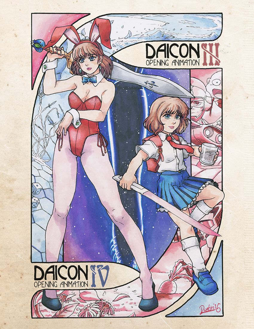
I wanted to focus on the biggest enigma of the series, Elysium and its overseers, the Master System. Nothing of all of them grouped together exists, and it's something I'd always wanted to do for quite some time. I threw Juno in there as well. Despite his absence from MML2, he was the one to drop the bombshell on our hero (and the player) at the tail end of 1. I also snuck in the silhouette of Sera's final form, making her the dividing line between the Master and those who were to keep his order.
Colors were tripping me up pretty bad on this, as I had multiple markers run out on me, and being short-funded for resupplies, had to make due with what I had. Some was salvageable, some had to require some trickery to fix or hide. I debated making a space scene at the very top of the background and have it fade at the midway point, but decided against it. It's not the illustration Mega Man Legends deserves, but it's definitely one I needed to do.
April 6, 2016
Micron pens, Sakura Pigma pens, normal pens, Prismacolor Markers, colored pencils, and gel pens
on 8.5x11" cardstock
Labels:
2016,
colored pencil,
Gatz,
Geetz,
gel pens,
Juno,
Legends,
Master,
Mega Man,
Micron,
Prismacolor,
Sera,
Traditional,
Volnutt,
Yuna
Friday, April 1, 2016
Nouveau Daicon
"Nouveau Daicon"
(From DAICON III & IV Opening Animations)
I decided I wanted to revisit the DAICON animations, while trying some more art nouveau stylings; something I'm trying to get better at. I considered having two separate illustrations, but couldn't think of enough to fill the pictures well, so decided on making another joint picture between the two films. I also made the characters much more within my own personal style (Something I don't really do much), making them look considerably more realistic. Though I'll admit, I'm still terrible at discerning a child's facial structure from an adults...
I added the picture to an aged paper texture I found digitally, to give the final look of an authentic Mucha-esque look. Also, because I forgot to during the inking process, I changed the roman numerals of the titles from black to their respective colors digitally, as well.
April 1, 2016
Micron pens, Sakura Pigma pens, Prismacolor Markers, colored pencils, and gel pens
on 8.5x11" cardstock.
Paper texture and touchups added digitally.
Monday, February 22, 2016
I Wanna Get the Kitty!
"I Wanna Get the Kitty!"
(Crono, Marle, and Lucca from Chrono Trigger / Gift art for Vinesauce)
Over at Vinesauce, Vinny is playing Chrono Trigger; arguably one of the best RPGs ever made, and his self-proclaimed favorite game. When he was messing around on his second stream trying to "catch the cat" in the sewers in 2300 AD, something inspired me to do a piece reminiscent of Akira Toriyama's original illustrations for the game.
I actually did the lineart for this piece twice, as the first time I did it was heavily rushed to display on their booru (to which he showcased that night). I decided I could do better, to which I feel I did indeed. To keep in line with the mock-style of Toriyama's works, I had the new lineart printed onto parchment paper to give it a bit of mood toning. Using the white pencils and gel pens on this colored paper really pops the highlights. The Vineshroom on the wall was a last-second addition to the lineart before coloring to personalize it to the stream.
February 22, 2016
Micron pens, Pigma pens, Prismacolor Markers, charcoal pencil, colored pencils, and gel pens
on 8.5x11" celery parchment paper.
Labels:
2016,
cat,
Chrono Trigger,
colored pencil,
Crono,
gel pens,
Lucca,
Marle,
Micron,
parchment,
Prismacolor,
Vinesauce,
Vineshroom
Tuesday, February 16, 2016
First and Last
"First and Last"
(Xenogears, Elly, and Fei from Xenogears)
February 10th, 2016, marked the 18th anniversary of Xenogears release in Japan of 1998. And it's one of those games where you either never heard of it or it became one of the largest, most narrative-driven, and controversial JRPGs you've ever played, especially at its time. And I still feel it's a game that does not get near the amount of love it deserves, from either fan or its own rights holders, though it plant the seed for Tetsuya Takahashi's two spiritual successors series, Xenosaga for the PlayStation 2 and Xenoblade for Nintendo systems.
For this piece, I wanted to focus on the last scenes of the game, which involved the ultimate reunion of Fei and Elly in the dimensional rift of the final battle. I'd been wanting to do an illustration involving the titular mecha Xenogears for quite some time, however, this proved difficult as it's by far one of the most complicated designs I've ever seen, and can look really strange from the wrong angles... Fei and Elly came together with surprisingly minimal complication, though the lighting style started to baffle me as I approached the lighter shades.
Also, I threw in a hidden "character" for this piece; one that only people who've completed the game would recognize, and even then, may have a hard time recalling. (lol)
February 16, 2016
Micron pens, Pigma pens, Prismacolor Markers, charcoal pencil, colored pencils, gel pens, and chalk pastels
on 8.5x11" cardstock.
Sunday, December 6, 2015
MegaMan Juno
"MegaMan Juno"
(MegaMan Juno from the Mega Man Legends)
Maybe it was just the shock of this character, who came almost literally out of nowhere in the last few minutes of Mega Man Legends, or his strangely calm, callous demeanor, but something about Juno stuck with me. Once I discovered no official art exists for his character (despite one very rough draft, which hails from one guide book), I knew I had to somehow make up for that...
I tried my best to mimic Hideki Ishikawa's at-the-time style to allow it to mesh with his other designs from the game, though going with the lighting used on the reaverbot illustrations, since he tends to fit in better with them than characters like the Bonnes or even MegaMan, himself. I don't declare it 1-for-1, by any means, but I think I got fairly close. The red digital-esque lines were a challenge to pull off, but I think they came out good given what I was working with. The final touch was giving it a "scanned" look, using some filters and reverse-DNR, just to really cement it into looking "official."
December 6, 2015
Micron pens, Pigma pens, Photoshop Elements 7.0
4224x5746 pixels
Subscribe to:
Comments (Atom)


