Showing posts with label digital touchup. Show all posts

Sunday, February 2, 2020

HELL SIDE


"HELL SIDE"
Key illustration

This will provide a 2-page chapter cover spread for the second section of Volume Two.
This piece, like HEAVEN SIDE, was a challenge for many reasons. One, of course, is the more up-front subject, but also the semi-realistic style, the pencil lineart, softer shades, and most importantly, the wings. The blood cry was also interesting to do, and I think I kinda mucked it up a bit in regards to the stream running along her cheek...
I completed the traditional portion of this art quite some time ago, however due to the subject matter, taking it to scan at a public facility was a bit nerve racking.
The background base admittedly uses a couple stock photos that I heavily manipulated and retooled because I had an earlier attempt at doing a fire effect in an illustration prior and the final look wasn't up to par for something this size, as well as to feel similar to HEAVEN SIDE's approach.

February 2, 2019
Colored pencils, Prismacolor Markers, and POSCA paint pens
on 14x17" smooth bristol stock.

Background digitally created and added via Photoshop Elements 7

Fated Sword Dual Balance ©Studio OZKai

Saturday, February 1, 2020

HEAVEN SIDE


"HEAVEN SIDE"
Key illustration

This will provide a 2-page chapter cover spread for the first section of Volume Two.
This piece was a challenge for many reasons. One, of course, is the more up-front subject, but also the semi-realistic style, the pencil lineart, softer shades, and most importantly, the wings, which I used several real-life references to make look as believably real as possible while not standing out too much from the stylized nature of mine.
I completed the traditional portion of this art quite some time ago, however due to the subject matter, taking it to scan at a public facility was a bit nerve racking.
The background base admittedly uses a stock photo that I heavily manipulated and retooled because I had no confidence doing such dense cloud coloring on an already complicated piece.

February 1, 2019
Colored pencils, Prismacolor Markers, and POSCA paint pens
on 14x17" smooth bristol stock.

Background digitally created and added via Photoshop Elements 7

Fated Sword Dual Balance ©Studio OZKai

Saturday, March 2, 2019

You Must be Exhausted...


"You Must be Exhausted..."
(Mother 3)

A piece I did for Mother 3 after watching Vinny Vinesauce's stream for the game.
That ending was such a gut punch.

I also did a version with lyrics from Red Vox's "Cemetery Window."

March 2, 2019
Sakura Pigma pens, Prismacolor Markers, colored pencils, and POSCA paint pens
on 9x12" smooth bristol stock.


"Sleep Pushing Down On Me"

March 2, 2019
Text added via Photoshop Elements 7.0

Friday, May 4, 2018

Ties of Sea and Flames


"Ties of Sea and Flames"
(Xenogears)

I had initially planned this for another illustration, but scrapped it and used the concept for these two for itself. The images were drawn and colored separately and put together digitally for the final. Trying to match the poses between the two while maintaining the perspective of the differences in size was interestingly challenging.

Coloring was even more of a trial because, surprise, some of my markers are wearing out, meaning I should replenish soon. So some of the colors are touched up here to keep this from becoming a shelved project. Oddly, this effected Fei way more than Weltall, which had minimal problems with marker dry-out and more just trying to replicate its shades of blues. Thankfully, the new figure announced helped me better understand its color layout, so this should be my most accurate-to-official Weltall illustration yet.

May 4, 2018
Normal pen, Sakura Pigma pens, Prismacolor Markers, colored pencils, and gel pens
on 2 8.5x11" cardstocks 

Compiling and background done digitally via Photoshop Elements 7.0


Individual images of Fei and Weltall.

Thursday, November 3, 2016

Warrior of Love


"Warrior of Love"
(Ptera Ranger from Kyoryu Sentai Zyuranger /
Pink Ranger from Mighty Morphin Power Rangers)
 
I'd been trying for a few years to do more pieces for the original Zyuranger/MMPR crew, but kinda got overwhelmed with my original format that I had done with Green Caesar and a few other Sentai works. However, I thought to do something more stoic, but trying to up my sense of natural stance and lighting. I chose the Ptera/Pink Ranger as my first subject because I never did any of the females, prior.

I tried my best to capture all the little details of the suit itself, right down to seams in the sides and front, and even the pad detail of the gloves. The buckler wording unfortunately took thicker than I was hoping, so that part ended up quite messy, up close especially. Getting things such as how the spandex and the hard plastic shines with the light source to the back quarter were things I had to figure out on my own, as I don't have many mobile lights in my work space to properly experiment.

I added the background post-scanning as I thought the image to be too weak on its own without something for it to pop against. And I lack marker colors to get the particular gradient in the way I could here.

November 3, 2016
Normal pens, Pigma pens, Prismacolor markers, Colored pencils, and gel pens
on 8.5x11 cardstock

Background created and edited in via Photoshop Elements 7

Friday, April 1, 2016

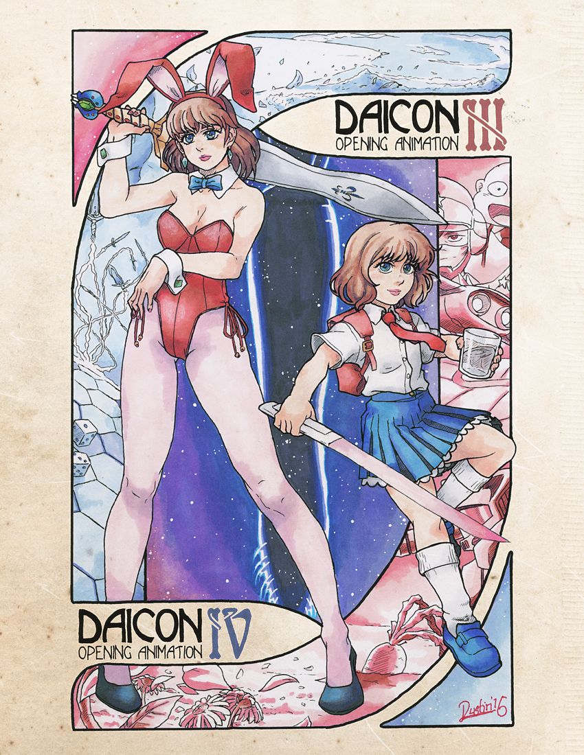
Nouveau Daicon


"Nouveau Daicon"
(From DAICON III & IV Opening Animations)
 
I decided I wanted to revisit the DAICON animations, while trying some more art nouveau stylings; something I'm trying to get better at. I considered having two separate illustrations, but couldn't think of enough to fill the pictures well, so decided on making another joint picture between the two films. I also made the characters much more within my own personal style (Something I don't really do much), making them look considerably more realistic. Though I'll admit, I'm still terrible at discerning a child's facial structure from an adults...

I added the picture to an aged paper texture I found digitally, to give the final look of an authentic Mucha-esque look. Also, because I forgot to during the inking process, I changed the roman numerals of the titles from black to their respective colors digitally, as well.

April 1, 2016
Micron pens, Sakura Pigma pens, Prismacolor Markers, colored pencils, and gel pens
on 8.5x11" cardstock.
Paper texture and touchups added digitally.

Sunday, February 7, 2016

Crystal Flash


 "Crystal Flash"
(Samus Aran from the Metroid series
)
 
I guess chalk this piece up to the fact that there was an ability in Super Metroid (and some later games) that I had absolutely no idea existed prior to about a month ago. The Crystal Flash is a technique you can use in truly desperate situations to heal all of your energy tanks at the cost of all your special weapon energies. This places Samus in a healing ball, shed of her armor and otherwise defenseless, but growing strong again.

I tried to tell myself the next time I drew Samus would be in her trademark armor, but it seems I went even further back and put her in less than the last one. (lol) I tried to make this look as soft as possible, but of course, my markers will always leave some rather rough lines, still. Fortunately, using pencil instead of pen for the lineart definitely aided in the light look and I feel countered where the markers were working against me. I actually had to do a little extra digital work on the glow, as one of my markers unknowingly ran out, and I'm not sure when I can replace it. It was a subtle touch up, but one that was needed to complete the effect.

 February 07, 2016
Prismacolor Markers, charcoal pencil, colored pencils, and gel pen
on 8.5x11" cardstock.

Added digital coloration, Photoshop Elements.